
Case Study
Squarespace Web Design, Strategy & Copywriting for Active Rehab Rx in North Vancouver, British Columbia.
Kinesiology Clinic. Rehab, Prehab & Corrective Exercise.
About the Project
-
A kinesiology clinic in North Vancouver, BC, offering prehab classes, rehab classes, three month programs, private corrective exercise and initial assessments.
-
Health & Rehabilitation / Kinesiology
-
Custom Website, Messaging & Conversion Strategy, Copywriting & Custom Build
-
To make the right path obvious, so someone arriving with a specific injury finds the program built for it and knows exactly how to book.

Where We Started
Kerri runs a kinesiology clinic in North Vancouver. Her website had been doing its job for about six years, which is a decent run for a website.
In those six years the business grew. More programs, more specialization, a much clearer sense of who she helps and how. The website hadn't kept up.
This is the thing I see most often with established business owners, and it almost never looks like a problem from the outside. Nothing is broken. The website still works, still looks fine, still loads. It's just describing a version of the business that doesn't quite exist any more. As a business evolves the messaging has to evolve with it, and that very rarely happens on its own.
Which Path Is Mine?
Kerri's clinic isn't one service. There's prehab, rehab, and three month programs, and inside those sit programs built for specific areas and injuries: shoulder, low back, hip replacement, pelvic floor. osteoporosis and osteoarthritis, menopause strength and youth inuries.
Underneath all of it is a rule that matters a great deal: rehab starts with a private initial assessment, prehab doesn't. Obvious once somebody explains it, and completely invisible until they do.
So the home page had to teach before it asked for anything, walking each person toward the route that actually fits them.
Two People, One Page
Then there were the program pages, and each one had to work for two entirely different visitors.
The first arrives from an ad. They don't know the clinic, they've never heard of Kerri, and they've just clicked on something about hip pain. They need to understand what this is, whether it's meant for them, whether it's safe, and whether people in their situation have done it and been fine.
The second arrives from a referral. Their physio mentioned it, or a friend did. They already trust the place. They want to book and get on with their day.
Those two need opposite things. The first needs the whole story. The second needs a button.
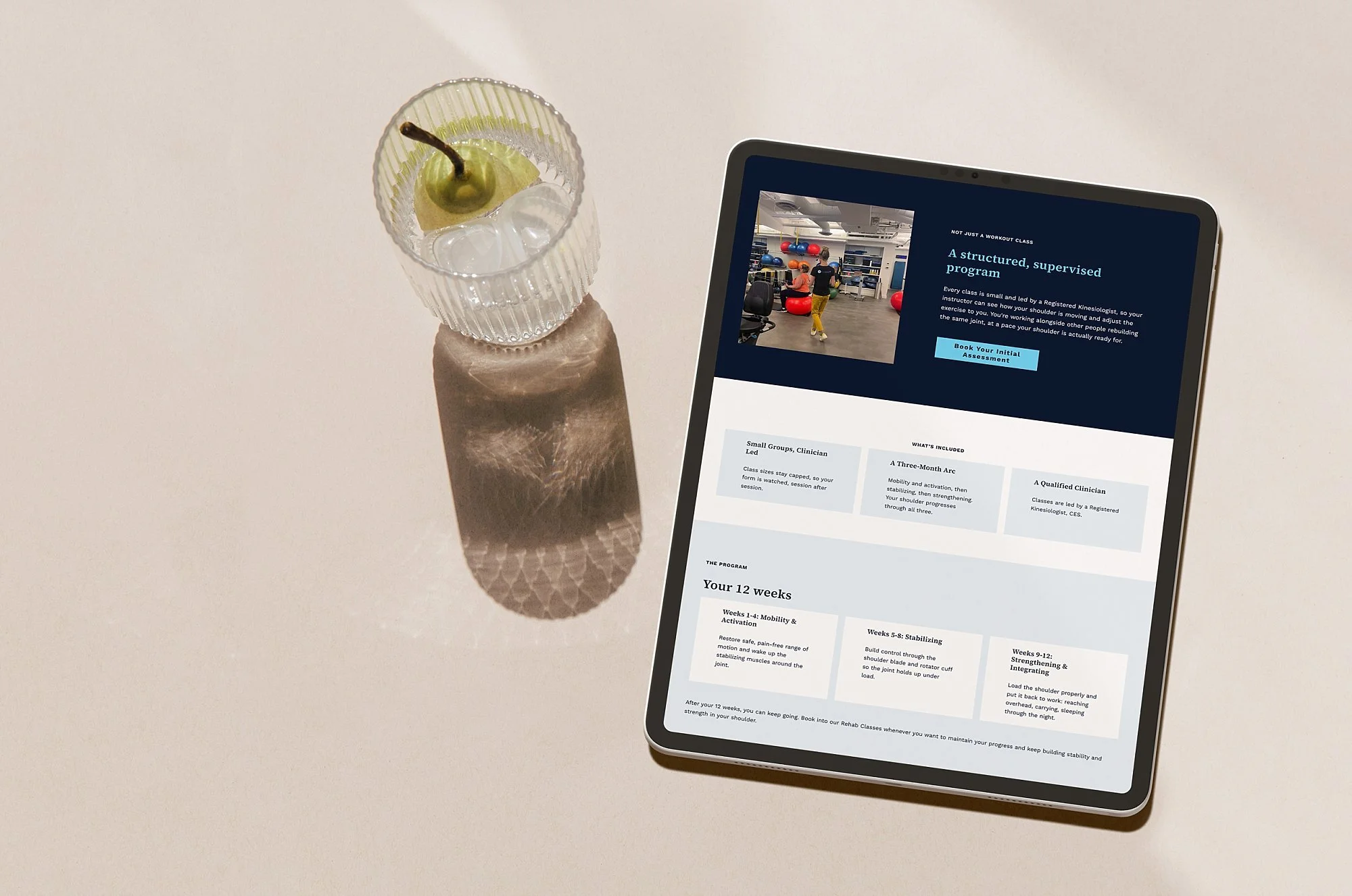
The pages Kerri had were accurate and thorough. They told you precisely what each class involved. What they were missing was a clear and easy path to booking, and the few things a person needs to hear before they'll take it.
Because somebody who's just been told they need a hip replacement isn't weighing up a list of exercises. They're worried about making things worse. They want to know whether they'll be the least capable person in the room, and what actually happens in a first session.
So the new pages describe the person rather than the class. The hip program opens with the reasons people actually turn up to it. Waiting for a replacement. A few weeks post surgery. Trouble with stairs. Pain that won't settle. You read down that list and either see yourself in it or you don't, which is a far easier thing to do than reading what a class contains and working out whether it applies to you.
And the booking button sits near the top as well as the bottom, so the person who already knows can skip the scroll and book.
What We Built
A page for each program, written for the person looking for that exact thing rather than sitting as one line in a list of everything the clinic does.
A three step getting started section on each one, so the assessment rule is now somewhere people can see instead of something they have to work out.
The booking calendar embedded on the page itself, so the last step happens where the decision gets made rather than somewhere else entirely. Client testimonials are on the pages too, from people who were in the same position as the person reading.
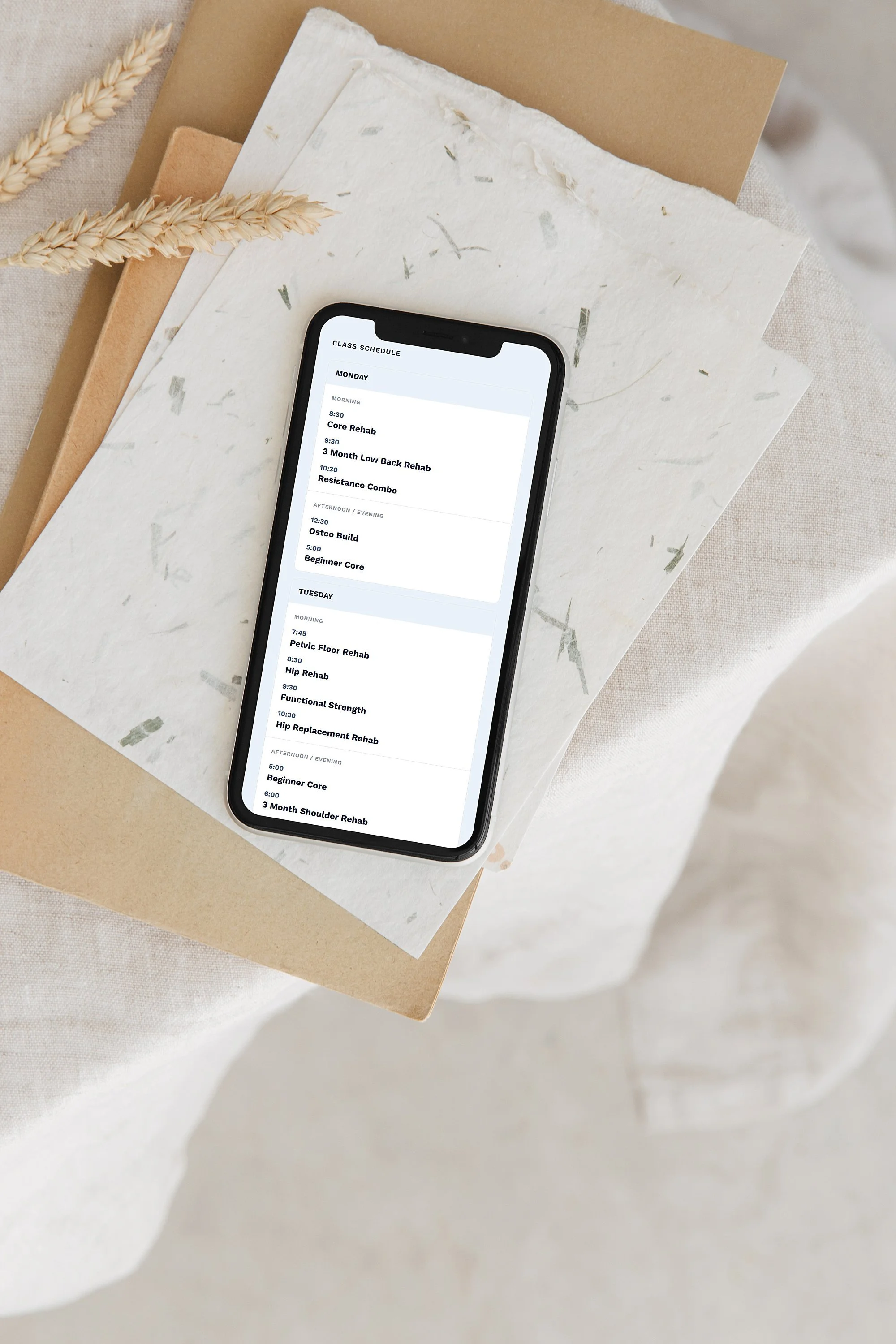
A custom built class schedule. The offerings are varied enough that an ordinary calendar struggles, and website calendars have a habit of falling apart on a phone. They either shrink until nothing is readable, or they make you scroll sideways to find the rest of the week. This one was coded to rebuild itself depending on the screen it's on. Same information, laid out differently, readable either way.
And a simpler menu. The old one listed every program at the top level, which quietly asked you to already know which one you needed.
The old URLs redirect to the new pages, so existing links and ad destinations don't break.
The Search Side
Kerri had a real advantage going in. Her clinic is called Active Rehab Rx, and active rehab is one of the terms people in BC use for this kind of work, so she was already turning up well for her own name and for the category. The business name does a lot of that work on its own.
When a client is already strong in search, I go looking at what else people are typing.
Because the person who needs Kerri usually isn't searching for a clinic. They've just been told they need a hip replacement, or their shoulder has been bothering them for months, and they're at home putting their problem into Google or asking an AI tool what their options are. They don't have a clinic name in mind yet. Plenty of them have never heard the phrase active rehab.
That's the search I want her in front of, and it's what the program pages are built for. Each one is written around a particular injury and the questions that come with it, which gives a search engine, or an AI tool answering that same question, something to match against that a home page never could.
If You're the Expert in What You Sell
Here's a pattern I see with specialists, and this project shows it nicely.
When you know your field properly, you describe your work the way you understand it. Accurately, thoroughly, in the terms that matter professionally. That's expertise doing exactly what expertise should do.
The person reading just has a different starting point. They've got a problem and a decision to make, and what helps them most isn't a complete description. It's knowing whether this is for them, whether it's safe, and what happens next.
That’s where I come in. I’ve spent years learning how websites convert, how buying decisions actually get made, and how to structure the whole thing so search engines and AI tools can follow it. That’s a different skill entirely from being excellent at the thing you sell.
It isn't about making the words prettier. It's moving them from how you'd explain your work to a colleague, to how you'd explain it to someone standing in front of you looking worried.
Kerri's expertise hasn't changed. What changed is that it reaches people while they're still deciding, instead of once they've already walked through the door.
If your Website Is A Few Years Behind Your Business
It usually isn't obvious. The website still works. It still looks reasonable. It's just explaining what you used to do, to people deciding whether to book what you do now.
That's a messaging problem before it's a design problem, and it's the one I solve most often.